Brand | Print
Branching out to create a flourishing brand. A family run business providing tree care for the local community, Hartford Tree Care stands tall amongst its competitors with a fresh new look. Paying homage to it's bread and butter, or should we say roots with a forest green and a barky orange that cuts through a forest of pine and lime greens competing for attention in the tree surgeon industry. Not every tree in the forest is the same tree.
Seeing the wood for the trees
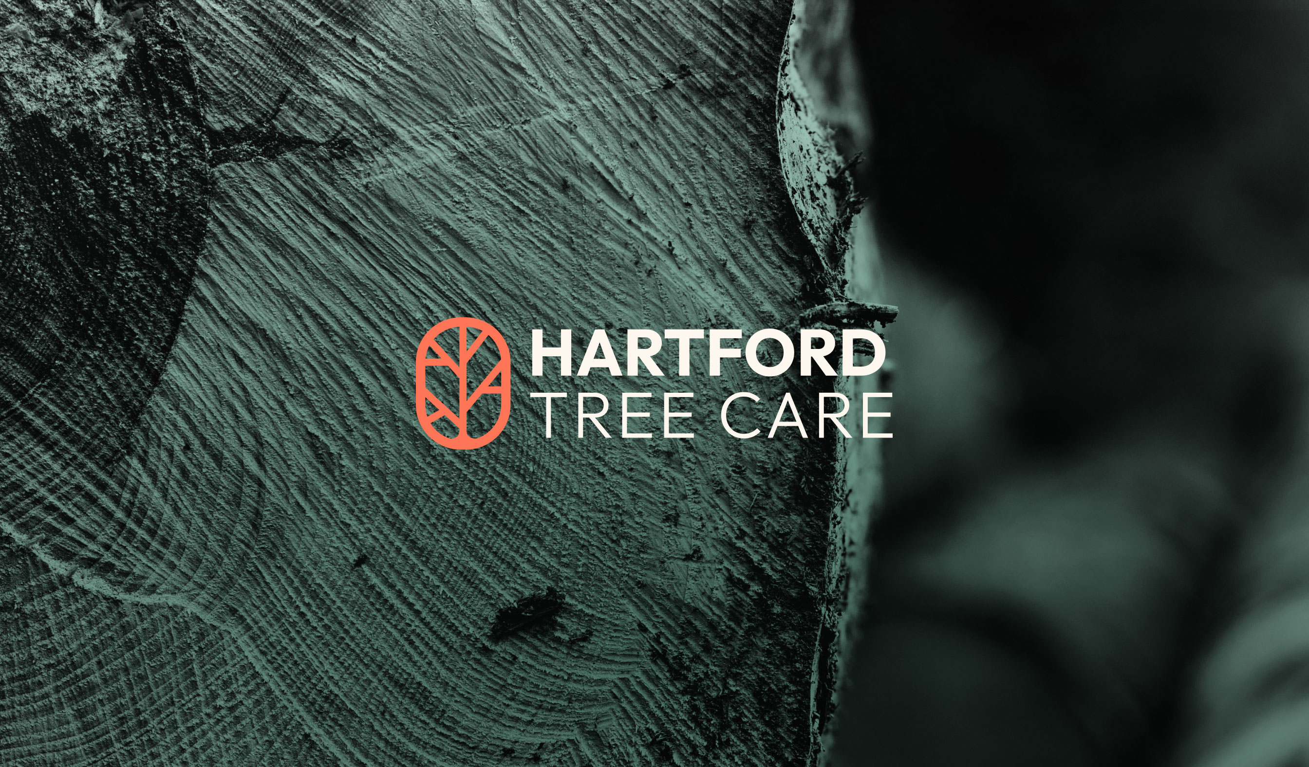
Hartford Tree Care's existing logo was not extraordinary but outdated and dull. Our mission was to create a brand that would help the business stand out from the crowd of local arborists and tree surgeons in the area. Communicating the high-quality service and expertise that the team provide for their customers, as well as the care and pride they have for the local area. Hartford is a bustling village in the heart of Cheshire. The high street hosts locally owned shops, cafes and eateries, with little streets and parks branching off the side of the main road flowing through. The logo not only represents a tree but is inspired by Hartford's roads and streets. The warm orange denotes the warmth of the owners and the bright orange of their STIHL equipment. And the off white reminiscent of sawdust.

Having a versatile visual icon to be used as a pattern makes for a strong visual identity. The imagery needs to capture the action but also a serenity that trees often evoke. After all the brand is all about caring and preserving trees where possible. Building a strong brand sews the seeds for a business to flourish. By creating a harmony between the strength of colours, a friendly and clean typeface and strong images, you can get a sense of who the business is and how the next chapter of their business is going to go from strength to strength.

